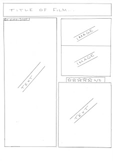
This is the first of our four review draft ideas. This is an original idea with very little similarities to the ones we looked at whilst researching. We are aware this may be risky; however all of the obvious conventions and necessities are within it.
The title of the film is placed at the top of the review in a large font. Below this, the page is split into two columns, with text down the hand side. On the right hand we have placed two images, vertically placed underneath each other. These images will be taken from the filming proccess. The star rating is then below these images, with the stars a larger font to the text and in a different colour to make it stand out. The final piece of text then fills the rest of this column.

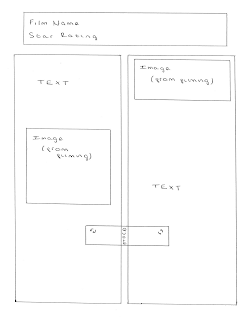
This is our second film review draft idea. It is similar to the first in the use of two images and large title at the top of the page.
Below the large heading placed at the top of the review we have put the star rating. We agreed that this was a good place for it to be put as it catches our eye immediately and may entice the reader to read the rest of the review if the film has a good star rating. Again the page is split into two columns, this time with the text even over the columns with an image on either side. The images will be shots taken from the filming process so the audience have a realistic idea of how the film will be.
In the centre of the two columns we have placed a quote taken from the review. This will be the critic’s opinion of the film and general sum up, i.e. 'fantastic'.

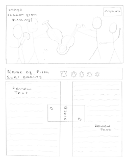
Our third film review draft is different to the others we have created so far. At the top of the page we have placed a large image taken from the filming process, with a caption in the top right hand corner in a black box with white text. This immediately catches the reader’s eye and will hopefully make them want to read on. The name of the film is below this in a large font, along with the star rating below. The star rating will be actual stars, rather than written numbers to separate the rating from the text below.
The text is again split into two columns but this time no images break it up. Because the image takes up quite a large amount of space I don't believe the amount of text not broken up will put them off reading it. There is a quote again in the centre of the two columns acting as a sum up.

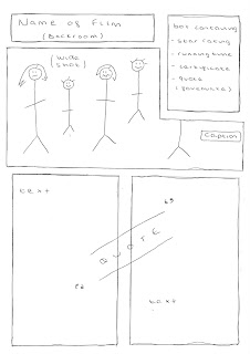
I like this final draft as it is of a different layout to the other reviews I analysed from the magazines. I have placed the name of the film ('Backroom') at the top of the page so the reader is immediatly aware of what the film is they are reading about. Below this, similar to the 'Made in Dangenham'review I looked at, I have placed a large main image taken from the filming process. I have also added a caption, conventionallly put at the bottom right hand corner of the picture. I intend to make this caption, with the white text and black background)fun but at the same time relevant to the film.
As I didn't like the idea of having to search for basic info about the film within in the review I have placed a box overlapping the image at the top of the page containing the star rating, running time, genre, etc. This means the most important bits about the film are easy to find and gives a personal twist to our own review.
The review text is written below the film title, info box and image. I noticed when researching the magazine reviews that text was split into columns so it is easier on the eye for the reader. To break up the text I have placed a quote/critic review line in the centre of the text which will be in a different colour & style font so it will stand out.
Below are our final two developed draft ideas. The first is a mixture of draft 3 & 4 above. We like the idea of placing a large image at the top of the review to attract the eye and promote the film. The image contains all of the band members posing, looking into the camera lens. Conventionally, the image has a small fun caption with the white text and black background making the review look more professional. Just above the main image I have put the name of the film in large white letters with a thick black outline. Below the image the first thing to stand out is the star rating. We have coloured the stars re rather than the conventional yellow colour to differ from typical magazine reviews. We then have the review below this.
The text is split into two columns, with a question and answer style layout. This is similar to the review I annotated from 'Star' magazine for the film 'Eat, Pray, Love' where the review was set out in three parts. I have written 'what happens?' as the first heading. Under this heading I plan to write down the plot, including the names of cast and crew. This will be the longest of the three, taking up a full column. My next question will have the heading 'so, what's it like?’ Under this one I plan to write our opinion and general critic review of the film under this. A short quote from this section in red writing will be spread across the two columns, breaking up the text and catching the reader’s eye. The final heading will say 'final verdict'. This will have a three or four word some up of the film, a last quote/few words to sell the film.
In the bottom right hand corner of the second column we have placed a box which will contain important information on the film, including what the genre is and the films running time. I like this idea as the audience don't have to search within the text for important pieces of info about the film, which irritated me when I looked at the reviews for research.

This is my second draft idea. It is like draft four which we designed. It is also similar to the developed draft above. At the top of the page I have placed the name of the film, 'Backroom' with the star rating below. The stars again are in red, going against the conventional yellow colour. A large image is then placed below this. Again, the image has the band members from left to right across the screen, split into the three bands. We have moved the caption from the conventional right hand side of the image, to the left as we have placed the box containing important info over the top right hand corner of the picture. Again, we like the idea of this box so the audience are immediately aware of the vital bits about the film like the genre and running time. The text in the box will be in a red font to match the stars, making it stand out from the rest of the review text over the rest of the page.
Below this image we have put the text under question headings, similar to the developed draft above. Each heading is written in a colourful bold font, making it stand out. This also allows the reader to flick to the bit of the review they want to read. For example, they may want to read the critic review to see whether the film is any good before moving on to the plot summary. Once again, the text has been split into two columns to make it easier on the eye for the reader and a critic quote (e.g. ''wickedly funny") has been placed in between the columns in a large red font to break up the text.

No comments:
Post a Comment