Wednesday, 20 October 2010

Film Poster Drafts & Developed Drafts

These are our 4 initial film poster drafts. They are drawn on A4 plain paper and are full page size. We decided against making them on the computer as it was generally easier to just use pencil and paper to get our ideas down quickly and we scanned them into the computer as we completed them. It took us approximately 10-15 minutes to finish each one. Our drawings are in black and white and the pictures and text are displayed simply with boxes and stick men because they are just our first set of draft ideas. We used our film poster research to help us come up with our own designs, both changing and using the conventions we noted down. We came up with two ideas each, then brought them together at the end to chose a final poster draft.


This is the first draft which Beth designed. She has conventionally placed a large image of the actors at the front of the page, immediatly catching our eye, with the front two angrily placing their heads together as if they are about to fight. The actors stood behind the two at the front are looking into the lens with worried/angry/confused expressions. I like this pose as it is humerous and gives just a little away about the film itself. The name of the film is at the bottom of the page, just above the two critic reviews at eaither side of the star rating in tbe middle. At the top of page Beth has placed a tagline. All of the text conventionally overlaps the image as not to break up the page. Overall I like this draft, however I wouldn't chose to put the tagline at the top, I would put the name of the film there instead so the audience know what film is being advertised.


This is Beth's second draft idea. The general layout is similar to the first one she created with the star rating and two critic reviews at the bottom of the page. Again, the tagline is placed at the top of the page and the name of the film is at the bottom in a large font in the shape of an arch. The large image contains a few of the actors, with two standing out at the front facing each other with their guitars clashing. This pose is again humorous and reflects the plot without giving too much away. Some of the actors to the left and right of the two with the clashing guitars are looking directly at the camera and some are looking away, with similar worried/angry/confused expressions on their faces. I love the creativity of the pose which Beth has come up with in this draft however again, I would have placed the name of the film at the top rather than at the bottom.


This is the first of my two film poster drafts. My layout idea differs to both of Beth's as I have placed the name of the film across the top of the page, about a quarter of the way down. This is written in a large font so is easily identifiable. This overlaps a large image I have used to fill the A4 page with. I plan to have two of the actors on a stage, with a spotlight shining down from the top left hand corner. They will be looking directly into the camera lens with happy faces, again different to the expressions in Beth's two draft ideas. I have placed a critic review along with star rating in large speech marks to the right of the page, ever so slightly overlapping one of the actors. This allows the audience to get a quick opinion on the film, persuading them to watch. At the bottom of the page I have conventionally placed a list of crew and the director with the production company logo across the bottom with the white text on a black background.


This is my final draft idea. I messed around the layout to make it different from the first draft I created so we had more choice when it came to picking a favourite. In this draft I decided to place the crew and director unconventionally across the top, rather than the bottom. The name of the film, along with the films tagline will below this. I like the idea of having the name towards the top of the page so the audience can immediately identify what film the poster is advertising. Compared to the image I chose to use in my first draft this one is more mockumentary style and fun. It shows a band member to the right hand side of the screen with 3 critic type judges behind with their arms folded looking at the man disapprovingly.

Out of the four drafts we have come up with so far there is not one in particular that I am drawn to. I love the position which Beth has placed the actors across the front, with the attitudes and poses showing that our film is fun and a mockumentary. I do prefer however the layouts that I created, with Beth and I agreeing that they are more conventional and profesional. When we come up with the final draft we plan to mix and match ideas from all four designs as not one stands out.


After we filmed our posters we decided that we wanted to simply put a guitar leaning against a pub door on the front, rather than people. As well as being easier we like the unconventional and unique style idea, matching well with our band mockumentary idea. Not too much is given away however the audience are made aware of the music/band idea. These are the two develpoed drafts we came up with:


This firs draft shows the guitar propped up against a door. The background is black, matching the door colour. We like the white text of 'Backroom' against the balck of the background as we believe this will be striking and stand out. Our questionnaire results also supported the idea that people like the black & white colour scheme with another bold/bright coour. Below the main image we have placed a review quote, along with a star rating. These will be written in the bold/bright colours (yellow or blue) so it attracts the eye.


This second developed draft is similar to our first idea. We have kept the same door with the guitar leaning as the background image, however have changed the colour of the guitar to red to match the 'Backroom' film title at the top of the page. We have placed the star rating at the top of the page for this design this time which means after looking at the image and reading the name of the film this is the next thing that catches the eye. A small critic review is placed at the bottom of the page just like the one above, but this time we have put a list of cast and crew (in white font) in the bottom right hand corner.

Film Review Drafts & Developed Drafts


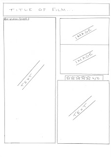
This is the first of our four review draft ideas. This is an original idea with very little similarities to the ones we looked at whilst researching. We are aware this may be risky; however all of the obvious conventions and necessities are within it.

The title of the film is placed at the top of the review in a large font. Below this, the page is split into two columns, with text down the hand side. On the right hand we have placed two images, vertically placed underneath each other. These images will be taken from the filming proccess. The star rating is then below these images, with the stars a larger font to the text and in a different colour to make it stand out. The final piece of text then fills the rest of this column.


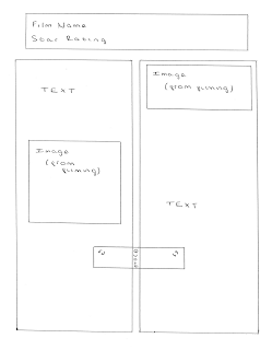
This is our second film review draft idea. It is similar to the first in the use of two images and large title at the top of the page.

Below the large heading placed at the top of the review we have put the star rating. We agreed that this was a good place for it to be put as it catches our eye immediately and may entice the reader to read the rest of the review if the film has a good star rating. Again the page is split into two columns, this time with the text even over the columns with an image on either side. The images will be shots taken from the filming process so the audience have a realistic idea of how the film will be.

In the centre of the two columns we have placed a quote taken from the review. This will be the critic’s opinion of the film and general sum up, i.e. 'fantastic'.


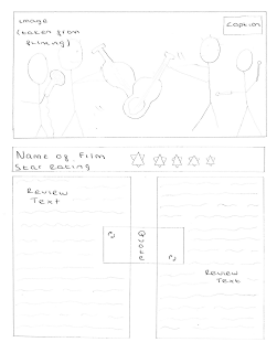
Our third film review draft is different to the others we have created so far. At the top of the page we have placed a large image taken from the filming process, with a caption in the top right hand corner in a black box with white text. This immediately catches the reader’s eye and will hopefully make them want to read on. The name of the film is below this in a large font, along with the star rating below. The star rating will be actual stars, rather than written numbers to separate the rating from the text below.

The text is again split into two columns but this time no images break it up. Because the image takes up quite a large amount of space I don't believe the amount of text not broken up will put them off reading it. There is a quote again in the centre of the two columns acting as a sum up.


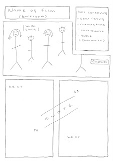
I like this final draft as it is of a different layout to the other reviews I analysed from the magazines. I have placed the name of the film ('Backroom') at the top of the page so the reader is immediatly aware of what the film is they are reading about. Below this, similar to the 'Made in Dangenham'review I looked at, I have placed a large main image taken from the filming process. I have also added a caption, conventionallly put at the bottom right hand corner of the picture. I intend to make this caption, with the white text and black background)fun but at the same time relevant to the film.

As I didn't like the idea of having to search for basic info about the film within in the review I have placed a box overlapping the image at the top of the page containing the star rating, running time, genre, etc. This means the most important bits about the film are easy to find and gives a personal twist to our own review.

The review text is written below the film title, info box and image. I noticed when researching the magazine reviews that text was split into columns so it is easier on the eye for the reader. To break up the text I have placed a quote/critic review line in the centre of the text which will be in a different colour & style font so it will stand out.


Below are our final two developed draft ideas. The first is a mixture of draft 3 & 4 above. We like the idea of placing a large image at the top of the review to attract the eye and promote the film. The image contains all of the band members posing, looking into the camera lens. Conventionally, the image has a small fun caption with the white text and black background making the review look more professional. Just above the main image I have put the name of the film in large white letters with a thick black outline. Below the image the first thing to stand out is the star rating. We have coloured the stars re rather than the conventional yellow colour to differ from typical magazine reviews. We then have the review below this.

The text is split into two columns, with a question and answer style layout. This is similar to the review I annotated from 'Star' magazine for the film 'Eat, Pray, Love' where the review was set out in three parts. I have written 'what happens?' as the first heading. Under this heading I plan to write down the plot, including the names of cast and crew. This will be the longest of the three, taking up a full column. My next question will have the heading 'so, what's it like?’ Under this one I plan to write our opinion and general critic review of the film under this. A short quote from this section in red writing will be spread across the two columns, breaking up the text and catching the reader’s eye. The final heading will say 'final verdict'. This will have a three or four word some up of the film, a last quote/few words to sell the film.

In the bottom right hand corner of the second column we have placed a box which will contain important information on the film, including what the genre is and the films running time. I like this idea as the audience don't have to search within the text for important pieces of info about the film, which irritated me when I looked at the reviews for research.


This is my second draft idea. It is like draft four which we designed. It is also similar to the developed draft above. At the top of the page I have placed the name of the film, 'Backroom' with the star rating below. The stars again are in red, going against the conventional yellow colour. A large image is then placed below this. Again, the image has the band members from left to right across the screen, split into the three bands. We have moved the caption from the conventional right hand side of the image, to the left as we have placed the box containing important info over the top right hand corner of the picture. Again, we like the idea of this box so the audience are immediately aware of the vital bits about the film like the genre and running time. The text in the box will be in a red font to match the stars, making it stand out from the rest of the review text over the rest of the page.

Below this image we have put the text under question headings, similar to the developed draft above. Each heading is written in a colourful bold font, making it stand out. This also allows the reader to flick to the bit of the review they want to read. For example, they may want to read the critic review to see whether the film is any good before moving on to the plot summary. Once again, the text has been split into two columns to make it easier on the eye for the reader and a critic quote (e.g. ''wickedly funny") has been placed in between the columns in a large red font to break up the text.


Storyboards

We bagan the story boards once our inital ideas were established and we knew where we wated to go with our short film. We were aware that storyboards are a vital part of the planning proccess as they can be used as a guidline for shooting & provide an outline. Our teacher gave each group a photocopy from a book which showed us how to create a good storyboard and the factors we needed to include. I highlighted and made notes on the handout whilst Beth began drawing up our storyboards. As she was drawing I was telling her bits we needed to include and helped decide a clear layout we would both be able to understand. I scanned the help sheet in with my highlights and notes on:


Although I helped Beth to decide on what to draw she is the stronger drawer of the pair of us. Each time she finished a frame I wrote the elements of the frame, including the setting, camera distance, angle and editing notes. This is our finished storyboard:


Film Poster Research

To get a good idea of the conventions in film posters already on the market we picked three popular mockumentary style posters of films out now. These were 'Confetti', 'Borat' and 'Drop Dead Gorgeous'.


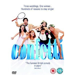
This was the first film poster we looked at taken from the film Confetti. The tag line, in the form of a scroll at the top of the page suggests the mockumentary genre type to us. We are make aware of the fact that a competition takes place where a wedding is won. The tag line on this poster is reasonably long, however some words are written in a larger font to attract the eye and persuade the reader to look at it. Surrounding this is a mass of confetti, keeping us in tune with the wedding theme and leading us to the film name which is placed below the tag line. This is written in a huge font, standing out and making us aware that this is the name of the film. The letters are so large that characters are standing in between the letters. This idea as quirky and original.

The image placed on the front of the poster shows the characters placed in fun positions, looking into the camera lens. The comedy genre is established through this as all of the characters have happy expressions and are messing around. The background is white which doesn't give the audience too much to look at (in a good way!). This means the page isn't cluttered and all of the characters can be easily seen. We both agreed that we liked the image showing the characters personalities and had the idea of having our bands all on screen in separate groups, with expressions and poses that match their personalities. For example, the arrogant band would have a stiff stance and wouldn't be smiling into the camera lens.

Below this image there is a second tag line. This tag line makes the audience aware of the rom com genre, 'Three Weddings. One Happy Couple'. The font that this is written in is fancy which matches the 'posh wedding' style. At the bottom of the page they conventionally have a list of cast and crew. Like other films this is written in a mix of thin, tall and short font sizes. This seems the most obvious place to place this information. The release date is also written down here.

This looks like the poster of a feature film as nothing indicates that the film is a mockumentary. We like how the characters are presented on the poster, all looking cheerful however the layout doesn't include a critic review or star rating, something we would like to have on our own film poster.


The second film poster I looked at was taken from the film 'Borat'. The layout is a little different to the poster I looked at above. The first thing I notice is the use of image. The main character is presented to the audience alone. We immediately know it is a comedy as he has a funny moustache, is dressed funny and is holding an American flag. The direct mode of address shows him to be looking up right at the audience but the position of the camera makes him appear vulnerable. Just placing one character on the front of the poster wouldn't work for us as our film is about bands however we do like this idea. I like the use of dull colours (brown, yellow) which make the name of the film stand out.

The name of the film is written in large letters across the actors waist. The font used is original and memorable and conventionally matches the poster style well. A tag line is placed below the film name but this is more about the plot, not giving away the unique mockumentary style.

The cast and crew are unconventionally placed around the outside of the film poster, acting as a border. This idea is original and I personally haven't seen this being done before. The main actor's name is placed at the top of the page, just above the main image.


This is the final poster we looked at and it is for the mockumentary 'Drop Dead Gorgeous'. Immediately I notice a difference in the style of image used. There are people in the image, however it is just their legs with no direct mode of address. Just below the legs we see the faces of the girls who they belong to. These are in the form of a gunshot which hints at the black comedy aspect. The woman lying flat next to the girls stood up also emphasises this. In the top right hand corner of the page there is a tag line. This is written in black font and stands out from the white background. The words used suggest that this film is a feature film in the comedy genre.

This poster is very female orientated, however the pictures in the bullet shots hint a slight darkness. We can't tell specifically from this poster that the film is a mockumentary so we still have no idea if there are any specific conventions we need to include in our own.

The cast and crew are conventionally written across the bottom of the page just like the film 'Confetti'. The text is white so stands out from the black of the background and the font is small, long and thin. The actors names are written under their names which suggests they are famous.

Sunday, 17 October 2010

Film Review Research

Before I even start thinking about planning my film review I needed to carry out research on film reviews in magazines already out and on the market. I wanted to look at 3 film reviews so I had a good number to compare, analyze and gain ideas from. I cut the reviews out of magazines and stuck them on A4 paper, drawing arrows coming from the image labelling the things I noticed. Although each of the three reviews I chose were short I believed they were good enough for me to note obvious conventions.
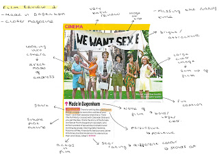


The first review I looked at was 'Made in Dagenham' cut from closer magazine. This was a very basic review but bright and attractive to the eye. A large image at the top of the review was clear and acted as a sum up of the film. Each character is looking directing into the lens, creating a direct mode of address which makes it more personal, giving the idea that the audience is being looked at directly and included as part of the film. In the bottom right hand side of the picture there is a caption. Because the magazine the review is taken from is a gossip magazine, the caption is fun & has relevance to the image rather than the actual film. Below the image we are told the name of the film in large bold clear text which our eye is directly drawn too. Next we are made aware of the genre (comedy/drama') which is in a yellow font with pink background below the name of the film. I like this idea as the audience don't have to search through the text for the genre. Directly next to the genre the reviewer goes straight into a very basic plot outline, not giving too much away but still using positive persuasive language such as 'feel-good' to promote the film. Within this other films are mentioned which are similar to the film in question. This is a way of letting people know what the film is like, generally making it sound better. The cast, but not the director are labeled after the subplot at the end of the review. I would have expected this information to be at the top of the review so was quite surprised when it was at the bottom, not standing out from the plot overview. A star rating was also shown at the bottom of the page, however unlike the crew stands out due to the hot pink colour, keeping up a colour scheme & matching the genre type text. The small amount of text is placed in one column which is slim, giving short lines quick and easy to read, attracting those who are maybe flicking through a magazine and don't want to be put off with a huge amount of text.

Overall, I do like the simple layout of this review which is easy on the eye and the amount of text doesn't overwhelm the reader. The image which is placed at the top is clear and acts as a mini film sum up which indicates the relevance of an appropriate image, something I hadn't even thought about. I also like how the genre is immediately established and the star rating stands out from the rest of the text.
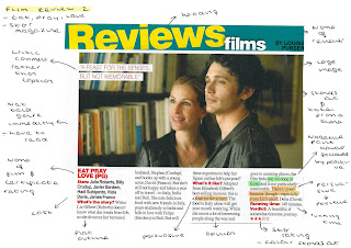


The second of the two reviews was from a similar kind of magazine as the first, named Star and the film is called Eat, Pray, Love. Again the layout is simple, with a large attractive image at the top. The actors in the image are looking away from the camera which suggests it is taken straight from filming. The close proximity of the male and female in the picture suggest the film is a romance however looking below we are not clear made aware of what the genre is without looking deeper in to the text. Overlapping the image, rather than a caption like the review before, there is a positive critic quote. I like this idea better than a caption which seemed to have no real relevance. Below the image we are told the name of the film in a bold red font, drawing our eye and making us aware of what we are reading. The certificate rating is also next to this, a feature we were not told in the first review but a vital piece of information for the reader. The stars of this film are presented underneath the name of the film in a bold text. If well known actors are in the film this may act as a form of persuasion & attract the readers attention. The reviewer, Louise Purser, sets out the review in the form of questions. I like this idea and think its original. The first of the two questions is 'What's the Story?'. Written beside this is a brief plot outline, stating who the actors are in terms of characters. The second question is, 'What's it Like?' gives the reviewers opinion of the film. Unlike the first review, a negative point is put forward ('way too long') however, this is backed up straight away by a positive ('good humour'). The term 'feast for the senses' is also used, which is a good strong opinion, persuading people to watch the film. At the end of the review the running time is stated, as well as an overall verdict and star rating. These are important details which make up a review so are presented in a bold red font. The final thing I notice is the layout of text, which is set out in columns stretching across the length of the image which makes the text easier to read, whilst at the same time making good use of space.

I prefer this review to the last. This is partly due to the extra bits of information given about the film, like the running time and certificate rating, as well as the names of the stars given immediately. I would have decided however to state the genre at the top of the review as I believe this is of relevance. I also like the colour red used on the review for important pieces of information. This is consistent throughout and works well at drawing the eye.
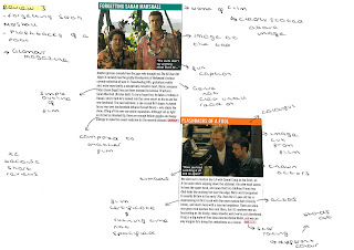


As the final review I looked at was short I decided to stick two from the same magazine on the page rather than just one. The films written about in these two reviews were 'Forgetting Sarah Marshall and Flashbacks of a Fool'. Unlike the other two reviews I have looked at, the name of these films are written above the main image. The text is white on both, however there is a block colour as a background, making it stand out from the page. Both images are cuts from the films, giving the audience an idea of genre the film is which again isn't stated immediately to us without looking deeper into the text. These reviews taken from Glamour magazine have a fun caption written over the image in the bottom right hand corner. I don't like this idea as I don't see the relevance of it, I would prefer a critic review if anything. Other than the name of film and image the only other colour is the star rating. This is in pink and original to the magazine as the stars are circles with mini G's for Glamour inside. This is a clever way of identifying the magazine.Within the text we are given a few names of the cast, as well as a very brief outline of the films stated and references to other films these two are similar to. We only get the reviewers opinion of the films in the last line (i.e. Forgetting Sarah Marshall - 'enough helium giggles & happy endings to make this sweet medicine for the recently dumped').

These two Glamour reviews are very simple and lacking pieces of information we plan to put into our own review, for example, the running time and genre. I like the name of the film at the top of the page above the image so it is established immediately.


I also used the internet to look at three film reviews on Borat, Confetti and The office to get an idea of the type of language used and writing styles.

Borat
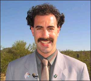


Sacha Baron Cohen looks set to have an even bigger success with his second film than he did with Ali G Indahouse. Borat (full title: Borat: Cultural Learnings of America for Make Benefit Glorious Nation of Kazakhstan) is the year's funniest film. Most viewers are probably going to want to watch it at least twice, as their laughter the first time around is likely to obscure much of the soundtrack.

From the opening scenes which show us Borat's supposed village in Kazakhstan (highlights include his sister, the country's fourth-best prostitute) to his trip across the Atlantic with his ursine producer Bagatov (Ken Davitian) in order to make a 'reporting' about the United States, the movie rarely fails to be anything less than spectacularly hysterical.

Baron Cohen takes a major swipe at the US in every scene and it's astonishing that he comes out alive. His initial attempts to make friends in a subway train are met with hostility bordering on physical aggression (Borat being Borat, he decides to calm the situation by releasing his pet cockerel in the carriage). He naively asks a group of street youths for fashion advice, attempts a bizarre version of the Star Spangled Banner in front of a rodeo crowd who boo him off the stage, and manages to convince a bunch of fervent evangelists that he is not only saved but speaking in tongues.

Everywhere he goes, calamity follows, not least if his bedraggled producer is in tow: their naked wrestling match proving to be the film's comic highlight. Even Pamela Anderson gets in on the act as the object of his cross-country affections.

Right wing evangelical Americans will be mortified and outraged: exactly the response Baron Cohen is looking for (and deserves). One can only hope that the more tolerant sections of the biggest power on earth may just realize that although most of this is largely exaggerated, their country faces becoming the butt of the rest of the world's jokes.

The film's slim running time, not usually a great sign, is also one of its strengths: it's hard to laugh non-stop for ninety minutes. With regular Curb Your Enthusiasm director Larry Charles at the helm it's not only a masterpiece of character comedy, but of comic timing.

Paul Hurley
-(talktalk.co.uk)

Plot Summary

Borat, a journalist in the nation of Kazahkstan, is sent to America by his government to film a documentary about US culture in an attempt to improve the standard of living in his own country. He and his producer, Azamat, arrive in New York City, where Borat, falling prey to culture clash, doesn't exactly make a great first impression (i.e., letting chickens loose on a subway, kissing random men on the street, etc.) While watching TV in his hotel room, he comes across a "Baywatch" rerun and falls in love with Pamela Anderson. He decides to leave New York to travel to Los Angeles to find her, but neglects to tell his producer the real reason he wants to travel to California. On the way, Borat meets many people, but ends up either humiliating or enfuriating all of them. For example, when he receives a driving lesson, he attempts to drink while driving, shouts obscenities at the other drivers, and asks his instructor to be his boyfriend. He attends a dinner party with some members of high society and successfully dismisses himself from the table to use the restroom politely, but brings a bag of... the result of the bathroom visit... back to the table with him. Minutes later, a prostitute he invited to the dinner shows up, causing the hosts of the party to throw him out. He stops at a rodeo to sing our National Anthem, but draws boos from the crowd when he replaces the lyrics to the Star-Spangled Banner with lyrics about his own native land and tells the crowd that he hopes for George W. Bush to "drink the blood of every man, woman, and child" who opposes us in the war on terror. One night, Borat finds Azamat, um, really enjoying a photo of his (Borat's) beloved Pam Anderson. They fight (in quite a crude way,) and in the end, Borat is left all alone in a strange place with no money and no passport. He ends up falling asleep on a sidewalk, but wakes up to realize that he is in front of a church. He goes inside, becomes saved, and journies on to California to find his beloved Pam Anderson.

(http://www.ruinedendings.com/film6289plot)

Confetti


CONFETTI
A bright and breezy British comedy which is frequently very amusing, Confetti borrows from the mockumentary style developed by Christopher Guest (Best in Show, Waiting for Guffman), but actually manages to be a lot funnier than his last effort A Mighty Wind. It also benefits from using a cast largely familiar from recent TV comedies, who all make an impressive leap on to the big screen.

Writer/director Debbie Isitt shows great confidence in a genre that could so easily provide plenty of pitfalls. This is sharp, well-observed and infectious stuff which surprisingly pulls at the heartstrings and deserves to be a commercial success.

It's a relatively simple plot that is explained very quickly at the beginning: the owner of Confetti magazine (an obnoxious Jimmy Carr) decides on a competition to find the Most Original Wedding of the Year. He and his editor (Felicity Montagu, best known as Alan Partridge's long-suffering assistant Lynn) choose the three couples who will contest the final and the rest of the film charts their progress as they attempt to win their dream marriage.

Couple one (Martin Freeman and Jessica Stevenson) are intent on an old-fashioned musical wedding, despite the fact that neither of them show much prowess in that department. Couple two (Stephen Mangan and Meredith Macneill) are competitive tennis freaks who insist on a centre court wedding (complete with Cliff Richard lookalike). Finally, Robert Webb and Olivia Colman (two of the stars of the excellent Peep Show) play a pair of naturists, and bravely wander around for ninety minutes in the buff.

Most of the preparations for the weddings prove to be very funny, but best of all are the two wedding organisers Heron and Hough (Vincent Franklin and Jason Watkins). A camp postmodern Gilbert and George, they are the comedic highlight of the affair and hold it all together, without diminishing the impact of the main three couples.

Confetti won't change the world, and doesn't even have a big message to make. It sets out to entertain, and more than does so. It looks like it was a lot of fun to make, and it's certainly a lot of fun to watch.

Paul Hurley
-(talktalk.co.uk)

Plot

Three couples endure the living hell that is the happiest day of their lives in this comic mockumentary. Confetti is the United Kingdom's most prestigious wedding magazine, and publisher Antoni (Jimmy_Carr) and editor Vivien (Felicity_Montagu) have made a career out of documenting the cutting edge in nuptial ceremonies. Antoni and Vivien have decided to stage a contest to find the most original wedding concepts in Britain; the Confetti staff will narrow the field down to three candidates, help the couples stage their weddings, and treat the grand prize winner to a major photo spread in the magazine as well as a new home worth 500,000 pounds. Before long, Antoni and Vivien announce the finalists: Josef and Isabelle (Stephen_Mangan and Meredith MacNeill), fitness enthusiasts who want a tennis-themed wedding; Matt and Sam (Martin_Freeman and Jessica_Stevenson), whose ceremony will be inspired by Hollywood movie musicals; and Michael and Joanna (Robert_Webb and Olivia_Colman), a pair of naturists who seldom wear clothes and want to be nude throughout the ceremony). Veteran wedding planners Archie Heron (Vincent_Franklin) and Gregory Hough (Jason_Watkins) are hired to help each couple have a day they'll always remember, though they may not look back on their work with fondness. Confetti was the second theatrical feature from director Debbie_Isitt; all the dialogue was improvised by the film's cast during the filming. Mark Deming, Rovi.

(http://www.starpulse.com/Movies/Confetti/Summary/)

The Office


Set in the bleak, awfully-named industrial town of Slough and the fictional office of the Wernam-Hogg paper merchants, a BBC film crew documents the expressionless workers, ringing phones, copiers churning out clone after clone after clone, pointless meetings and pointless bureaucracy that exist within typical, uninspiring companies.

Sadly, the majority of people in Britain work in dull, dead-end office jobs with lives that go nowhere and even the most meager of ambitions going unrealized. Maybe if they had a boss like David Brent their day would be livened up. Not because he's the 'boss/entertainer' he thinks he is, but for the morbid curiosity of watching a desperate, delusional and detestable man slowly crash and burn.

The majority of laughs in The Office come from awkward and embarrassing situations. Brent constantly forces his bullheaded and bawdy humor on unwitting staff. At first they appear scared of his ruthlessly imposing presence but towards the end they all ignore him completely. But he never realizes this and resorts to even more tasteless ways of getting attention. He loves the camera and rather than acting 'normal' for the purposes of the mockumentary he exaggerates his beastly character to the point of being sickening. He gets what he deserves in the end and by this point the audience has lost all sympathy for him.

His brutalized and beleaguered staff struggle to get on with their work as Brent's tyranny escalates. Among them we have Tim, an increasingly unhappy man who wishes to escape the monotony and drudgery 'ordinary life' brings him. He's long had the confidence crushed out of him but still has more humanity than anyone else.

Gareth is Tim's worst enemy. A dorky, 95 pound weakling who boasts of being in the (territorial) Army and is keen to assume more and more power from Brent's failing management. Like Brent, he has no clue about social interaction and behaves strangely among potential friends.

Dawn is the receptionist. She is engaged to a controlling, unloving boyfriend who insists she spend her life doing dull work despite the fact that she has higher and happier dreams. She has feelings for Tim, and they are more than mutual. But fear of change and happiness stops her from falling for him.

As soon as once branch of Wernam-Hogg incorporates the other it becomes clear how useless Brent is. The new staff are amazed at how such a horrid man has been employed at all, never mind become a boss. Complaints and unfinished work rise and the upper management are forced to take action. Sadly, Brent just won't learn.

In the end, his staff have the slightest chance at happiness and escape. Brent however doesn't learn from his mistakes and will probably go on to have an endlessly miserable life.

If you work in an office, get out! Among the blackest of humor there is a message; office life is fit for no human being. And Ricky Gervais' dark comedy is filled with thousands of examples of why this is so. It's absolutely classic stuff that is far ahead of dozens of canned laughter sitcoms.

(http://www.imdb.com/title/tt0290978/)

Plot

A mockumentary about life in a mid-sized suboffice paper merchants in a bleak British industrial town, where manager David Brent thinks he's the coolest, funniest, and most popular boss ever. He isn't. That doesn't stop him from embarrassing himself in front of the cameras on a regular basis, whether from his political sermonizing, his stand-up 'comedy', or his incredibly unique dancing. Meanwhile, long-suffering Tim longs after Dawn the engaged receptionist and keeps himself sane by playing childish practical jokes on his insufferable, army-obsessed deskmate Gareth. Will the Slough office be closed? Will the BBC give David a game show? Will Tim and Dawn end up with each other? And more importantly, will Gareth realize what a hopeless prat he is?

(www.imdb.com/title/tt0290978/)

Monday, 11 October 2010

Band Pose Research

Wanting to create an arrogant image of the bands in our mockumentry we printed out some images of the band interviews we researched. I looked to two images, one of Razorlight and the other of The Killers, the bands I used to research interview quotes. These bands were arrogant and big headed so I expected their poses and positions to reflect this. Whilst I carried out this, Beth looked at the Red Hot Chilli Peppers and PUSA, two more layed back bands who don't take their fame for granted. We both printed out each image in the centre of an A4 piece of paper ready to annotate. These are the notes which Beth took down:


The first of the two bands I looked at was Razor Light.


Razorlight is written at the top of this image in large, bold and capital letters. This particular font is the bands own and is recognisable to any fans of the band. When we look down below the text we are faced with the four members of the band. The big white gap between the men and the text suggests that they don't feel the need for a fancy background and 'faff' as they alone are enough. The band members themselves are looking directly into the camera. Non of the band members are smiling into the lens and are instead pulling moody expressions, personally I don't feel a connection between the audience and band. The black colour of their clothes also reflect the moodiness in the attitudes of the members. The clothes are also a sharp contrast against the white back ground, a simple idea making them striking against the page.


The second egotistical band I looked at was 'The Killers'. Immediately we are made aware of the bands arrogance as they place themselves in mid air on the page. This suggests to me that they are apotheosising themselves. By being above ground level it shows how they think they are better and above everyone else or immortal. The lead singer is at the front of the image, dressed in smart black clothes, looking not directly at the audience but slightly above them. This comes across as quite patronising. The text at the top of the image is in a small font which could let us assume that the band think we should automatically know who they are from image alone.


We can see a clear visible difference between the two bands Beth looked at & the ones I did. PUSA and Red Hot Chilli Peppers have fun poses which shows they take themselves a lot less seriously where as RazorLight and The Killers look more intense. Their positioning makes a difference to the way we see them. The Killers have themselves placed off the ground, showing how they believe they are better than others on the market. Not knowing the two latter bands very well I feel less in tune with them compared to the others. In our mockumentary this is the effect we want our band to portray, arrogant and egotistical.

Wednesday, 6 October 2010

Questionnaire

It was important that we handed out questionnaires so we could recieve feedback on our ideas so far and have a set of comparible secondary data. We wanted to recieve back representative data from our sample which we could write up and put into graphs. We decied to hand out 22 questionnaires, handed out mostlty to peolpe our age (17/18) as this is the audience we would like to attract. The class filled out the majority of our questionnaires however some were also given to friends to fill in as the class wasn't big enough.

This is a copy of our questionnaire:


We first enquired what gender the person filling out the questionnaire was as we wanted to see if different genders were attracted to diffent colours, fonts, etc as obviously we want to appeal to all. Although we picked am age range to hand out the questionnaires too we also asked them to specify which age category they were in as we did ask the odd adult/person under 18. We asked questions related to the short film, poster and review we planned to make, including colour schemes and fonts.

The questionnaires were vital as part of our research as we now know what people expect from our own work. If we could go back and make changes to the questionnaire we produced we would have asked more open questions to gain a better insight into what people want to see. Instead of this we asked a number of closed questions and had to ask people afterwards why they picked what they did (i.e, the film posters). This wasted a lot of time we didn't really have. We also left a lot of relevant information out of our questionnaire which I think we would have benefitted from. An example of this is colour scheme and font style. We didn't ask these questions and I feel this limited our feedback. These are our results: