Tuesday, 7 December 2010

Evaluation

In what ways does your media product use, develop or challenge forms and conventions of real media products?

In order to get a good idea of the conventions used in typical magazine reviews and film posters, as well as actual films already on the market it was vital we carried out helpful, clearly set out research. Generally, all three of our final pieces are conventional as we didn't see the point of changing what clearly works. We did however add a few of our own little quirks and twists to make the products our own.

Our main product was of the mockumentary genre so we carried out research specific to this. We made note of typical conventions such as awkward moments and jump cuts. As we wanted our own piece to look as realistic as possible we took these conventions then added our own unique twist. Our mockumentary generally matched the conventions however, because our film was only short we used a large number of jump cuts to establish the genre.

Our review matches the majority of basic conventions we noted during our research time. We have placed one large image at the top to sell the film, have included a star rating and made the layout clear, simple and not too heavy on the eye. Going against the mockumentary convention however, we used an image taken from filming with the characters in position for an interview but not looking into the camera. As the majority of time the characters are talking directly into the camera lens we thought it would be a positive change to make the image a little different and unexpected. We took this similar idea and carried it on to the poster too. Only placing a guitar and a door on the cover meant not too much was given away about the film and no direct mode of address was used. Apart from this, the rest of our poster is conventional. One large image is placed on the front with the name of the film, critic review and star rating on the front. We never added the cast on to the bottom of the poster. We didn't realise this until last minute so it was too late to change.

Our two ancillary tasks presented no direct mode of adders from the characters to the audience. This unconventional twist was effective and ironic as the mockementary genre is recognised from its use of characters talking directly into the camera.

We attempted to make the film poster on a landscape piece of paper as we liked the unconventional style. When it came to trying this out however we found it difficult to place all of our characters on without the space looking too empty at either end. Luckily we realised that this idea wouldn't work during the early planning process which meant we were able to simply replace that draft with a new, portrait one. Although we wanted to challenge the convention it wouldn't have made our end product poster as good.

How effective is the combination of your main product and ancillary texts?

We believe that our main product, as well as our two ancillary texts worked effectively together. We unintentionally ended up with a set colour scheme through out, with black white and red used in contrast with each other. In the two ancillary tasks we used these colours purposefully as we believed they were striking and worked well together, however when we came to edit the film we realised that the ambiance of the room was generally dark, matching the colour scheme we had already come up with.

The poster we created looked like an advertisement with the guitar leaning against the white door which is seen in the film. The door alone links with the setting of the film as it is nearly always in shot in the video. We are also made aware of the mockumentary genre as the poster looks like its advertising a competition, similar to the layout of the 'Drop Dead Gorgeous' poster we looked at during the research task.

The use of no direct mode of address in the review image which could be seen as unconventional. As the majority of our review was conventional we wanted to add our own twist. The film poster contains no actors which the just the door and guitar which meant again no direct mode of address was used. These linked together but contrasted to the mockumentary style of our film where the actors talk into the camera lens.

When asking peers if they believed the ancillary tasks matched the main product they agreed, commenting on our use of colour scheme to create a sense of continuity through out. Each task sells the other, working well effectively together.

What have you learned from your audience feedback?

Audience feedback was important to us not only at the end but through out the project so we were able to get an honest opinion of what the audience thought of our work to make it better. This started with questionnaires at the beginning of the process and ended with the final pieces being marked by the examiner. As we have carried out similar tasks in media before we both understood the importance of audience feedback as they will be the consumers of our products, making or breaking them.

We created questionnaires to hand out during the research part of the project. The questions centred around both ancillary tasks, as well as our main piece, the 5 minute film. We had already carried out a little bit of research into conventions so we Incorporated this into the questions we came up with. We asked opinions on colour schemes and film poster preferences. Twenty two questionnaires came back to us to annotate, a good and reasonable size sample for us to look at. Asking the majority of 17/18 year olds, our target audience, allowed us to get a good idea of what they want to see in and from our products. Using excel, we put the results into graphs then copy and pasted them into word, allowing us to write up what they told us. Throughout the planning process we were able to look back at our results to make sure we we incorporating audience ideas into our own work. They were a vital part of the research process, giving us strong primary research.

As well as the questionnaires, we asked the advice of our peers and teacher throughout the project. When ever we weren't sure of an idea we could present it to our friends who would give us an honest opinion of what they thought. The fact they weren't always media students was helpful as the were looking at our work as potential consumers. We asked what they thought of our initial band mockumentary idea and their views on our first drafts. Our teacher also wrote comments on our blogs as we worked through the project, noting down anything we had done wrong and bit we could improve on. All of the comments we received we worked on to try and come up with the best pieces we could.

We handed our cast the script a week before we were set to film. This not only gave them a chance to look through it and learn lines, but it allowed them to give us any advice if they didn't like the idea of certain bits or they needed re written. The week in between then gave us a chance to change the script. As well as this, when we were doing the actual filming, the cast did some improvisation of situations.

All in all we have received positive feedback on our completed final pieces. The only negative comment we received back was that our finished film didn't have a very good picture quality. This however was beyond our control as that was the only camcorder we were able to use. Our audience understood that.

How did you use media technologies in the construction and research, planning and evaluation stages?
We used a number of media technologies throughout this project in an attempt to record our work easily for marking and assuring our two ancillary tasks and main product looked as professional as possible.


We relied on BlogSpot to record all of our work and present our finished pieces. I had never used a blog to store my work before so I had no idea what to expect and whether I would like it. The blog was quick and easy to set up, with a password and user name making sure our work was protected. It also meant we could access the work from home through the Internet, allowing us to add things we had done at weekends/holidays without it piling up to add on at school during valuable lesson time. My teacher and peers were able to look over and check my blog as I was going along, pointing out any flaws. The blog also meant I and my partner could see exactly what each other were doing in terms of research and planning at what time, making sure we were up to the same point and not allowing each other to fall behind. Posts were easy to add and edit and any work I did in the lesson on paper could be easily scanned in and added. I encountered no major problems when using the blog. At times the internet was down at home which meant I couldn't add to my blog out of school. When this problem occurred however, I simply wrote up what I wanted to put on my blog in a word document and cut & paste it into the blog when I was next in school, which was quicker than having to type up the work when I needed to be getting on with something else. As well as this, the school accidenty blocked the BlogSpot website which meant we were unable to add images and view the blog at school. This went on for about two weeks. At first I thought it would cause me to fall behind but text could still be posted up, I just had to wait until I got home to view it online. This didn't turn out to be a major problem and didn't affect the time it took to complete my blog. I would definitely consider using this method of storing work again if I carried out a project similar to this. The blog was simple to use and presented my work neatly and effectively.


When work wasn't ready to put onto the blog, I relied on my pen drive to take work from school home to finish off. I also used it to store all of my files for back up just in case something happened to them in my school documents. I don't believe that I would have been finished by the deadline if I didn't have my pen drive as I would have only been able to carry out work at school.


As well as using the internet to publish my blog, I also used it to carry out the majority of research, using google as a basis for most of my searches. The images I annotated of the band members posing and film posters already out at the minute, were found through 'google images'. It was easy just to save the images onto my pen drive to paint. I also used the internet to annotate reviews and look at band interviews. I used this method as it was easy and could be done at both home and at school.


We also briefly used Word to compose the questionnaire as part of our research, as well as the results. We are very familiar with this programme so they were quick to complete and were present well. Word let us change colours to suit our project and pick fonts and their size. Once we had completed our questionnaires we printed them out ready to give to people to fill in. We needed to put our results on our blog so thought it easiest to present the results in word, then print screen them as a picture file. It took us approximately two, 55 minute lessons to get our questionnaires out, then back in to write up the results. No problems were encountered when using word, however it would have been easier for us if we were able to create the graphs here. Instead we had to use Excel to produce the graphs, the cut & paste them into word. It didn't take much longer but would have saved us a bit of time.

We used publisher to create both of the ancillary tasks, including our developed drafts. As we have used publisher before both in media and other subjects, it didn't take long to locate all of the tools we needed. We considered using fireworks as it is a more professional programme however decided against it as all of the fonts etc were on publisher ready to be used. It was also generally simpler but did the job for us and we could both access/change our work from home. The four developed drafts, two for our film poster and two for our review, took us under two lessons (110 minutes) to complete. We used images from clip art as they were copy right free. Again, we had no problems using the programme to present our work.


A hand held camcorder was vital to shoot our footage on the day of filming. As we had used a similar camera at BTEC level we knew which buttons were for what, allowing us to easily adapt and set up when we arrived on set. We didn't need a tripod as the majority of filming was shaky, fitting the mockumentary genre style. We encountered only a minor problem during the filming. Half way through a scene the camera died on us. Luckily, we had brought the charger along with us and the house setting meant it was easy enough for us to take the battery out and charge it up for 10 minutes so we could finish off. The extra 10 minutes also gave us time to inform cast of where they needed to positioned and what they needed to say. Altogether, it only took us 2 and half hours to film our material, giving us over 15 minutes to sort through in the editing process. We had difficulty gaining access to the cameras as other groups had booked them out at times when we could have used them. This was down to our poor time management and organisation, leaving us less time to edit our main product. The meant our planning and research was however up to date and carried out to a high standard. When we watched our clips back we realised that the sound quality wasn't very high. This was due to the camera we used rather that the way our actors were speaking so couldn't be prevented. We tried at the end to use the camera setting on the camcorder to try and take pictures for the ancillary tasks, however the quality wasn't very high so I used my mobile phone instead. This allowed me to easily transfer the images across to my pen drive when I arrived home to add onto the review and poster at school. I don't think I would like to use a camera similar to the one we used if I was set a filming task like this again. The quality wasn't great which meant the picture look grainy.

We used IMovie on the Mac computers at school to edit our film. As we had never used this programme before we were worried it would be difficult to navigate. Our teacher helped us to import the images from the SD Card to the computer, converting them to an mp4 format. We used 'Handbrake' to do this, again a programme we had not come across. Each clip had to be changed individually which took us nearly an hour as we had 43 of them. Once they were all converted we were able to open IMovie and import them all ready to edit. We watched all of the clips through first to refresh and check over the quality before we began to drag clips to the bottom of the screen. The editing process took us a full day to complete, made easier by the fact the majority of our cuts were messy and didn't need to flow precisely. We mainly used 'trimming' and 'split clips' not really needing to add any effects to the video except music which was added at the end. We decided it was easier to use a track from iTunes as this was copyright free, not forcing us to seek permission from other people which would have slowed us down. Overall, we encountered no major problems when we using IMovie. The programme was quick and easy to use, assuring our editing was completed on time. We had problems with some of the continuity as re took took some of the scenes then attempted to mix and match to get a variety of different angles. In some parts it worked really well and at others it was impossible to do. This leads me to think that we should have shot more material whilst we were on set.

Final Pieces

Our Main Product


This is our final main product. We underestimated how much footage we had and found it impossible to cut down without losing the basic plot of the story so were forced to go over the 5 minute time limit by one minute. As we heavily relied on improvisation we didn't have a script to refer to when editing which I believe was our timing downfall. On the day of filming not everyone turned up which we thought would cause us massive problems. We got round this by changing the bands around slightly and asking cast to improvise, which they had no trouble with. The improvisation was good as it fitted the mockumentary genre. Another problem we encountered was lighting troubles. The room we filmed in was dark and affected the quality of our film. At the time we tried our best to get as much light into the room as possible, bringing in 2 extra lamps. This ideally wasn't enough however we thought it would be easy to brighten up the film during the editing process.

Generally, we are happy with what we have created with the amount of filming and planning time we were allocated. The majority of cuts are sharp and messy, fitting the mockumentary genre style. We used IMovie to create the film, a programme neither me nor Beth had used before. The teacher showed us how to upload each video onto the computer and taught us the basics for editing, such as the trimming tool. We found it easy to use and would definitely consider using it again if we had a similar project. Our genre meant we were able to use footage that other groups may discard, such as when the actors weren't aware that the camera was rolling. No fancy effects were used and we found the soundtrack used at the end of the clip on iTunes. Not only fitting the music band theme it also meant the music was copy right free, not causing us any problems. This was the only soundtrack we used throughout the film and no non diagetic or bridges were used between scenes. This made our film more natural and realistic of a mockumentary.

If we could change our final product I think we would use a different camera to get a less grainy picture, as well as making sure we gave ourselves enough time to edit with no rush. We would also make the storyline more obvious and use a variety of different camera angles to get different perspectives.

Our Review


This is our completed review. Using our developed draft as a template we began to create our review using publisher. As we are both familiar with the programme we thought it would be the quickest and easiest way to present our review. It also prevented any problems occurring which we couldn't sort ourselves. We could have used Fireworks, a more professional programme, however we didn't need any fancy effects in the review.

At the top of the page we used clip art to write the name of the film 'Back Room'. We believe this is an effective place to put it as our eyes are instantly drawn to the top right hand corner of the page. The size font we used also means it catches the eye. Directly below this is our main image. This was taken from filming so the quality is slightly grainy, however it catches the action. The characters are positioned so they look like they are in an interview which gives away that our genre is a mockumentary. We have conventionally placed a caption with a black background and white font in the bottom right hand corner of the image. The cation reads, 'Sam and her scornful trio', a comment which catches the mood of the image. Unconventionally, we have placed the star rating over the image. The red stars contrast from the dark background, standing out and catching your eye. This was also the easiest place to put them.

All of the text is placed below the large image in conventionally two columns, making it easier on the eye. Between the columns we liked the idea of placing a quote to break the text up for the reader. The quote was written in a large red font, standing out and fitting our colour scheme. We wrote the review in the form of question and answer, similar to the review we looked at from star magazine. We liked this breakdown of information between the plot and the critics opinion. This also left room at the bottom of the page for a little info box where the reader could check the film genre, release date and running time without having to search through the text.

We stuck to our draft to an extent, only changing the positioning of the stars and the people in the image. We encountered no problems when creating this review and received generally positive feedback. If we could go back and change an aspect of the poster myself and Beth both decided that we would use a proper camera to take the image as the one from the camcorder was grainy.

Our Film Poster


This is my final ancillory task, the film poster.

I used the programme publisher to produce it as I believed it would make my final piece look more prefessional than if I had used a programme like Publisher. I have also had experience of using Fireworks at a lower level in BTEC so thought this would be a good opportunity to develop my skills further.

The background is an image of an accoustic guitar against a door which we took took a photo of on the day of filming. As the carpet was in the shot we used the laso tool to cut around the guitar, white door and wall then filled the outside of the image with black so it would stand out and be easy to add text over. Unconventionally I decided not to use people from the film on the poster so it would be a surpise when the audience watched the film and added our own twist to the mockumentary genre without losing general film poster conventions, still making it recognisable.

The name of the film is at the bottom of the poster, a common convention I noticed during the annotations of film poster currently out. I made sure that the fonts I used matched those which I placed on the film review above in an attempt to carry on the theme and create a house style. I also used the red, black and white colour scheme to reflect this and was also aware that these colours alone attract both male and female teenagers, and stand out.

Along with the name of the film at the bottom of the screen I placed a film company logo and made up website to ensure my poster looked as realistic as possible, as well as two members of cast at the top of the poster which every poster I analysed had.

Generally, the layout of the poster is very basic, yet easy on the eye and appealing which was the effect we wanted to promote.

Images

We were able to take some photos during the filming session. We took a number of different images to have a good variety to pick from and put onto our review.


These first two images are similar to each other. The band of girls are in there positions waiting to be interviewed. The expressions give across their diva attitude towards fame. Sam (Helen Martin) is the only one looking into the camera in both images, suggesting that they are action shots taken straight from filming, typical of a real review. The lighting in these pictures are decent, compared to some of the others below. We would definitely consider using one of them in the review.


The image below shows the arrogant band member, with Sam in the background. The lighting in this image isn't perfect however looks like its taken straight from filming, the look we were going for. I like how Brian (Robin Kerrison) is at the front of the shot, with Sam in the background watching him being interviewed. The camera is looking up at Brian suggesting how big he believes his ego is and giving him a look of self importance.


The next two images give off different attitudes of the girls band. The first shows all three looking into the camera forming a direct mode of address. Sam in the centre is smiling broadly in to the lens with the other two band members at either side smiling too. I like the friendly expression however it doesn't really fit the way they are portrayed in the movie. We ideally wanted the band to come across as unfriendly so this isn't one we will pick to place in the review. The image below is definitely more fitting. Sam is looking over to the other band with her two fingers up. Her expression is unimpressed and the other two look the same. We particularly like this image as it gives off the 'cold' vibe and represents the girl band.


This is the final image that we could put on our review. It shows Shaun (Mike Robinson) and Chris (Daniel Smith) in their interview. Both characters are looking into the camera lens. They both look quite relaxed, with Shaun leaning fully back in his chair. We like this image, however it is quite grainy and low quality. For this reason I don't think we'll be using it.


We also took the image of an acoustic guitar leaning against a door for our film poster. We were only able to take one image of this as the camera died however we are happy with the one we got. The light is perfect and there is just the right amount of wall to the right of the door. As we showed a black background in our developed drafts we edited the red of the carpet out of the image. To do this we used the programme Firework, which we used last year at AS level. We knew what the majority of tools were for so were able to locate the lasso to cut around the guitar base and door.


The Shooting of Our Film


Because we wanted a setting as realistic is possible so we tried our best to recieve permission to use a local social club in Cullercoats however this didn't work out. Instead, we went to a friends house to film as this was more convinent for all of our cast and we could stay to film for as long as we needed to.

We encountered a few problems on the day of the filming. One female band member dropped out the day before which gave us time to find a replacement but three people dropped out on the day. We were worried that the script would have to be altered so much at such short notice that it wouldn’t work out, however the six people that did turn up were fantastic at improvising and me and Beth were forced to play a part on screen, which we enjoyed. This gave us less control over what characters said but this made our mockumentary more realistic. Some of the best footage we got wasn’t in the scriped but was able to be woven into our basic storyline and added in. To fill in some time we also left the camera rolling between scenes when the actors were talking among themselves about random topics. This also made our mockumentary have a greater sense of realism.

The footage took us two and a half hours to shoot after school. It was more convenient for me and Beth, as well as the other members of the cast to get the material filmed all in one go. It meant that we would have less trouble with continuity problems, in terms of costume, props etc and it was the only time we could get everyone together on the same day.

All together we managed to shoot nearly 15 minutes worth of footage ready to edit. As the majority of our filming was improvised with just a set beginning and end we didn’t do many re takes when mistakes were made, meaning we should have enough material to put in to the short 5 minute film.

Wednesday, 24 November 2010

Contingency Plan

It was vital we produced a contingency plan prior to the shooting of our film to identify any problems we may come across and are able to solve them effectively ensuring we stuck to the deadline. As we had both had experience of creating a plan during our BTEC course last year we had an idea of where to start and what needed to be included. There were also text books which we used to help us remember the general layout and content.

We came up with two separate plans initially, listing problems we may come across and suggestions of what we would do if we came up against a specific problem. For example, we were worried that the video camera would not clearly pick up the sound of the actors talking. An idea to overcome this problem was to check the footage after the first piece of filming and make sure all the actors spoke clearly. Once we had completed our separate lists we brought them together and talked about what we had come up with. This was important to carry out as Beth came up with ideas that I hadn't thought of and vice versa.

This is a copy of an initial contingency plan we came up with initially:


Problems included use and responsibility of cameras, lighting and sound problems as well as getting all of the actors together in one place at the same time.

On the day of filming we took the contingency plan to the location in an attempt to allow the filming to run smoothly as we only had a limited amount of time due to our actors other commitments and our own deadline. Although it looks very basic it was useful on the day of filming and kept us on track and luckily it helped us overcome some problems. For example, the lighting wasn't great inside the house at our location as it was dark outside. To solve this I added some more lamps around the room. Although it still was not the perfect solution it worked to an extent and in turn made our short film appear better and more professional.

Tuesday, 16 November 2010

The Scipt & Shooting Script

This is a copy of our develped script. It took a few weeks to create and perfect, writing then re writing bits that we thought would be better changed. Beth carried out the majority of work on the script as this is the area of work she would like to work in, we both however contributed in generating ideas.


Before we began creating our shooting script we did a little research on why it was important to create and what needed to be included. We recieved a worksheet of the teacher showing us what should be included.


This is a copy of our shooting script, created once our actual script was complete. It was vital to create so we could take it with us to the venue, knowing all of the desired camera angles and movements. As the computers were not available in this lesson we created the shooting script on paper. We split the page in half, placing 'audio' on the left side and 'visual' on the right. On the left side we cut and placed the speech from the scrip and on the right, with our storyboards as a
guideline, we wrote what will be on the screen and the angle/movement of the camera.


Tuesday, 9 November 2010

Mockumentary Research

To get a good idea of the conventions required for a mockumentary, as well as the internet we each watched a mockumentary and took notes. I chose to look at the office, a popular and well known British sitcom/comedy/mockumentary with a number of series, each with a number of episodes.


I produced a table to make my notes on so I cut jot bits down as I watched and scanned it in. I looked at the first episode from the first series of the office, 'Down Size'. This mockumentry is in the form of a television series and is based around the day to day running of an office in Slough (UK.


As I wanted to gain extra ideas and compare conventions I also watched Drop Dead Gorgeous, the mockumentary Beth looked at. The film was based on the contestants of a beauty pageant, filming the fierce competition and lengths they will go to to win. My notes are much more basic than the ones I took down for The Office as that was the one we decided I should annotate.

Camera
Actors are aware cameras are there (most of the time!)
When characters are interviewed by the crew they are either looking slightly to the side of the camera or right into the lens
Point of View shots
Establishing shot at the beginning
Hand held camera – out of focus & shaky at times
Actors looking directly into the camera lens, right at the audience
Zooms & Depth of Field used frequently

Mise en Scene
Set all over the place, however the main setting is a school (natural)
Acting is over exaggerated – false at times
Natural lighting, make and costume up to fit the situation
Props to hand if characters need them – also very natural

Editing
Messy/sharp cuts
Texts at the bottom of the screen, introducing characters like in a documentary
Some non scripted moments are included in the final film

Sound
Crew talking behind the camera
Sometimes awkward moments
Mainly diagetic sound
Bridges between scenes


The analysis of current mockumentaries already out was vital so we knew what we had to include in our own. As we looked at two we were able to easily compare and work out conventions which allow the audience to identify the genre. We took into consideration that our research may be limited as we only looked at 2 mockumentaries in detail however we believe we received enough analysis back to be able to create our own and make it successful. We noticed that the camera work used in both mockumentaries was similar and established the genre. The crew talked behind the camera and it was often handheld, looking shaky and therefore more realistic. The actors were also aware a lot of the time that the cameras were there so looked directly into the lens (when being interviewed for example) or past the camera towards the crew. The editing was similar in the way that some cuts were messy and sometimes not stuck together chronologically. As well as this we noticed that in both mockumentaries text was written at the bottom of the screen, documentary style, showing who is talking, where they are/who they are and even a time or date. The majority of sound in the two mockumentaries we looked at was diegetic, meaning that the characters as well as the audience could hear it. There were however a few bridges with music where time had passed or the scene changed. A convention that I personally had not thought about but picked up in the analysis was the lack of sound between characters, indicating realistic awkward moments. Mise en scene was mainly natural, like the lighting, costume and setting for example. We did notice the obvious over exaggerated acting however which is used to distinguish the mockumentary genre. We plan to take all of these conventions into account when coming up with our script.

Wednesday, 20 October 2010

Film Poster Drafts & Developed Drafts

These are our 4 initial film poster drafts. They are drawn on A4 plain paper and are full page size. We decided against making them on the computer as it was generally easier to just use pencil and paper to get our ideas down quickly and we scanned them into the computer as we completed them. It took us approximately 10-15 minutes to finish each one. Our drawings are in black and white and the pictures and text are displayed simply with boxes and stick men because they are just our first set of draft ideas. We used our film poster research to help us come up with our own designs, both changing and using the conventions we noted down. We came up with two ideas each, then brought them together at the end to chose a final poster draft.


This is the first draft which Beth designed. She has conventionally placed a large image of the actors at the front of the page, immediatly catching our eye, with the front two angrily placing their heads together as if they are about to fight. The actors stood behind the two at the front are looking into the lens with worried/angry/confused expressions. I like this pose as it is humerous and gives just a little away about the film itself. The name of the film is at the bottom of the page, just above the two critic reviews at eaither side of the star rating in tbe middle. At the top of page Beth has placed a tagline. All of the text conventionally overlaps the image as not to break up the page. Overall I like this draft, however I wouldn't chose to put the tagline at the top, I would put the name of the film there instead so the audience know what film is being advertised.


This is Beth's second draft idea. The general layout is similar to the first one she created with the star rating and two critic reviews at the bottom of the page. Again, the tagline is placed at the top of the page and the name of the film is at the bottom in a large font in the shape of an arch. The large image contains a few of the actors, with two standing out at the front facing each other with their guitars clashing. This pose is again humorous and reflects the plot without giving too much away. Some of the actors to the left and right of the two with the clashing guitars are looking directly at the camera and some are looking away, with similar worried/angry/confused expressions on their faces. I love the creativity of the pose which Beth has come up with in this draft however again, I would have placed the name of the film at the top rather than at the bottom.


This is the first of my two film poster drafts. My layout idea differs to both of Beth's as I have placed the name of the film across the top of the page, about a quarter of the way down. This is written in a large font so is easily identifiable. This overlaps a large image I have used to fill the A4 page with. I plan to have two of the actors on a stage, with a spotlight shining down from the top left hand corner. They will be looking directly into the camera lens with happy faces, again different to the expressions in Beth's two draft ideas. I have placed a critic review along with star rating in large speech marks to the right of the page, ever so slightly overlapping one of the actors. This allows the audience to get a quick opinion on the film, persuading them to watch. At the bottom of the page I have conventionally placed a list of crew and the director with the production company logo across the bottom with the white text on a black background.


This is my final draft idea. I messed around the layout to make it different from the first draft I created so we had more choice when it came to picking a favourite. In this draft I decided to place the crew and director unconventionally across the top, rather than the bottom. The name of the film, along with the films tagline will below this. I like the idea of having the name towards the top of the page so the audience can immediately identify what film the poster is advertising. Compared to the image I chose to use in my first draft this one is more mockumentary style and fun. It shows a band member to the right hand side of the screen with 3 critic type judges behind with their arms folded looking at the man disapprovingly.

Out of the four drafts we have come up with so far there is not one in particular that I am drawn to. I love the position which Beth has placed the actors across the front, with the attitudes and poses showing that our film is fun and a mockumentary. I do prefer however the layouts that I created, with Beth and I agreeing that they are more conventional and profesional. When we come up with the final draft we plan to mix and match ideas from all four designs as not one stands out.


After we filmed our posters we decided that we wanted to simply put a guitar leaning against a pub door on the front, rather than people. As well as being easier we like the unconventional and unique style idea, matching well with our band mockumentary idea. Not too much is given away however the audience are made aware of the music/band idea. These are the two develpoed drafts we came up with:


This firs draft shows the guitar propped up against a door. The background is black, matching the door colour. We like the white text of 'Backroom' against the balck of the background as we believe this will be striking and stand out. Our questionnaire results also supported the idea that people like the black & white colour scheme with another bold/bright coour. Below the main image we have placed a review quote, along with a star rating. These will be written in the bold/bright colours (yellow or blue) so it attracts the eye.


This second developed draft is similar to our first idea. We have kept the same door with the guitar leaning as the background image, however have changed the colour of the guitar to red to match the 'Backroom' film title at the top of the page. We have placed the star rating at the top of the page for this design this time which means after looking at the image and reading the name of the film this is the next thing that catches the eye. A small critic review is placed at the bottom of the page just like the one above, but this time we have put a list of cast and crew (in white font) in the bottom right hand corner.

Film Review Drafts & Developed Drafts


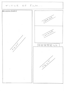
This is the first of our four review draft ideas. This is an original idea with very little similarities to the ones we looked at whilst researching. We are aware this may be risky; however all of the obvious conventions and necessities are within it.

The title of the film is placed at the top of the review in a large font. Below this, the page is split into two columns, with text down the hand side. On the right hand we have placed two images, vertically placed underneath each other. These images will be taken from the filming proccess. The star rating is then below these images, with the stars a larger font to the text and in a different colour to make it stand out. The final piece of text then fills the rest of this column.


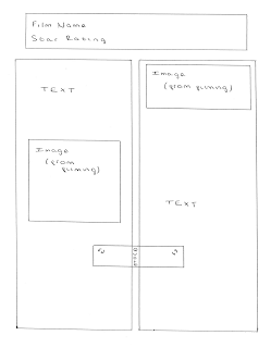
This is our second film review draft idea. It is similar to the first in the use of two images and large title at the top of the page.

Below the large heading placed at the top of the review we have put the star rating. We agreed that this was a good place for it to be put as it catches our eye immediately and may entice the reader to read the rest of the review if the film has a good star rating. Again the page is split into two columns, this time with the text even over the columns with an image on either side. The images will be shots taken from the filming process so the audience have a realistic idea of how the film will be.

In the centre of the two columns we have placed a quote taken from the review. This will be the critic’s opinion of the film and general sum up, i.e. 'fantastic'.


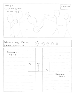
Our third film review draft is different to the others we have created so far. At the top of the page we have placed a large image taken from the filming process, with a caption in the top right hand corner in a black box with white text. This immediately catches the reader’s eye and will hopefully make them want to read on. The name of the film is below this in a large font, along with the star rating below. The star rating will be actual stars, rather than written numbers to separate the rating from the text below.

The text is again split into two columns but this time no images break it up. Because the image takes up quite a large amount of space I don't believe the amount of text not broken up will put them off reading it. There is a quote again in the centre of the two columns acting as a sum up.


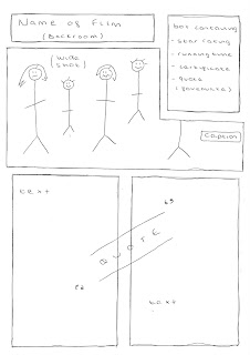
I like this final draft as it is of a different layout to the other reviews I analysed from the magazines. I have placed the name of the film ('Backroom') at the top of the page so the reader is immediatly aware of what the film is they are reading about. Below this, similar to the 'Made in Dangenham'review I looked at, I have placed a large main image taken from the filming process. I have also added a caption, conventionallly put at the bottom right hand corner of the picture. I intend to make this caption, with the white text and black background)fun but at the same time relevant to the film.

As I didn't like the idea of having to search for basic info about the film within in the review I have placed a box overlapping the image at the top of the page containing the star rating, running time, genre, etc. This means the most important bits about the film are easy to find and gives a personal twist to our own review.

The review text is written below the film title, info box and image. I noticed when researching the magazine reviews that text was split into columns so it is easier on the eye for the reader. To break up the text I have placed a quote/critic review line in the centre of the text which will be in a different colour & style font so it will stand out.


Below are our final two developed draft ideas. The first is a mixture of draft 3 & 4 above. We like the idea of placing a large image at the top of the review to attract the eye and promote the film. The image contains all of the band members posing, looking into the camera lens. Conventionally, the image has a small fun caption with the white text and black background making the review look more professional. Just above the main image I have put the name of the film in large white letters with a thick black outline. Below the image the first thing to stand out is the star rating. We have coloured the stars re rather than the conventional yellow colour to differ from typical magazine reviews. We then have the review below this.

The text is split into two columns, with a question and answer style layout. This is similar to the review I annotated from 'Star' magazine for the film 'Eat, Pray, Love' where the review was set out in three parts. I have written 'what happens?' as the first heading. Under this heading I plan to write down the plot, including the names of cast and crew. This will be the longest of the three, taking up a full column. My next question will have the heading 'so, what's it like?’ Under this one I plan to write our opinion and general critic review of the film under this. A short quote from this section in red writing will be spread across the two columns, breaking up the text and catching the reader’s eye. The final heading will say 'final verdict'. This will have a three or four word some up of the film, a last quote/few words to sell the film.

In the bottom right hand corner of the second column we have placed a box which will contain important information on the film, including what the genre is and the films running time. I like this idea as the audience don't have to search within the text for important pieces of info about the film, which irritated me when I looked at the reviews for research.


This is my second draft idea. It is like draft four which we designed. It is also similar to the developed draft above. At the top of the page I have placed the name of the film, 'Backroom' with the star rating below. The stars again are in red, going against the conventional yellow colour. A large image is then placed below this. Again, the image has the band members from left to right across the screen, split into the three bands. We have moved the caption from the conventional right hand side of the image, to the left as we have placed the box containing important info over the top right hand corner of the picture. Again, we like the idea of this box so the audience are immediately aware of the vital bits about the film like the genre and running time. The text in the box will be in a red font to match the stars, making it stand out from the rest of the review text over the rest of the page.

Below this image we have put the text under question headings, similar to the developed draft above. Each heading is written in a colourful bold font, making it stand out. This also allows the reader to flick to the bit of the review they want to read. For example, they may want to read the critic review to see whether the film is any good before moving on to the plot summary. Once again, the text has been split into two columns to make it easier on the eye for the reader and a critic quote (e.g. ''wickedly funny") has been placed in between the columns in a large red font to break up the text.


Storyboards

We bagan the story boards once our inital ideas were established and we knew where we wated to go with our short film. We were aware that storyboards are a vital part of the planning proccess as they can be used as a guidline for shooting & provide an outline. Our teacher gave each group a photocopy from a book which showed us how to create a good storyboard and the factors we needed to include. I highlighted and made notes on the handout whilst Beth began drawing up our storyboards. As she was drawing I was telling her bits we needed to include and helped decide a clear layout we would both be able to understand. I scanned the help sheet in with my highlights and notes on:


Although I helped Beth to decide on what to draw she is the stronger drawer of the pair of us. Each time she finished a frame I wrote the elements of the frame, including the setting, camera distance, angle and editing notes. This is our finished storyboard:


Film Poster Research

To get a good idea of the conventions in film posters already on the market we picked three popular mockumentary style posters of films out now. These were 'Confetti', 'Borat' and 'Drop Dead Gorgeous'.


This was the first film poster we looked at taken from the film Confetti. The tag line, in the form of a scroll at the top of the page suggests the mockumentary genre type to us. We are make aware of the fact that a competition takes place where a wedding is won. The tag line on this poster is reasonably long, however some words are written in a larger font to attract the eye and persuade the reader to look at it. Surrounding this is a mass of confetti, keeping us in tune with the wedding theme and leading us to the film name which is placed below the tag line. This is written in a huge font, standing out and making us aware that this is the name of the film. The letters are so large that characters are standing in between the letters. This idea as quirky and original.

The image placed on the front of the poster shows the characters placed in fun positions, looking into the camera lens. The comedy genre is established through this as all of the characters have happy expressions and are messing around. The background is white which doesn't give the audience too much to look at (in a good way!). This means the page isn't cluttered and all of the characters can be easily seen. We both agreed that we liked the image showing the characters personalities and had the idea of having our bands all on screen in separate groups, with expressions and poses that match their personalities. For example, the arrogant band would have a stiff stance and wouldn't be smiling into the camera lens.

Below this image there is a second tag line. This tag line makes the audience aware of the rom com genre, 'Three Weddings. One Happy Couple'. The font that this is written in is fancy which matches the 'posh wedding' style. At the bottom of the page they conventionally have a list of cast and crew. Like other films this is written in a mix of thin, tall and short font sizes. This seems the most obvious place to place this information. The release date is also written down here.

This looks like the poster of a feature film as nothing indicates that the film is a mockumentary. We like how the characters are presented on the poster, all looking cheerful however the layout doesn't include a critic review or star rating, something we would like to have on our own film poster.


The second film poster I looked at was taken from the film 'Borat'. The layout is a little different to the poster I looked at above. The first thing I notice is the use of image. The main character is presented to the audience alone. We immediately know it is a comedy as he has a funny moustache, is dressed funny and is holding an American flag. The direct mode of address shows him to be looking up right at the audience but the position of the camera makes him appear vulnerable. Just placing one character on the front of the poster wouldn't work for us as our film is about bands however we do like this idea. I like the use of dull colours (brown, yellow) which make the name of the film stand out.

The name of the film is written in large letters across the actors waist. The font used is original and memorable and conventionally matches the poster style well. A tag line is placed below the film name but this is more about the plot, not giving away the unique mockumentary style.

The cast and crew are unconventionally placed around the outside of the film poster, acting as a border. This idea is original and I personally haven't seen this being done before. The main actor's name is placed at the top of the page, just above the main image.


This is the final poster we looked at and it is for the mockumentary 'Drop Dead Gorgeous'. Immediately I notice a difference in the style of image used. There are people in the image, however it is just their legs with no direct mode of address. Just below the legs we see the faces of the girls who they belong to. These are in the form of a gunshot which hints at the black comedy aspect. The woman lying flat next to the girls stood up also emphasises this. In the top right hand corner of the page there is a tag line. This is written in black font and stands out from the white background. The words used suggest that this film is a feature film in the comedy genre.

This poster is very female orientated, however the pictures in the bullet shots hint a slight darkness. We can't tell specifically from this poster that the film is a mockumentary so we still have no idea if there are any specific conventions we need to include in our own.

The cast and crew are conventionally written across the bottom of the page just like the film 'Confetti'. The text is white so stands out from the black of the background and the font is small, long and thin. The actors names are written under their names which suggests they are famous.